Until Dawn Remake Looks Impressive But How Much of an Upgrade Is It?
For a game that faced its share of delays and had almost zero marketing from Sony, it’s incredible that Until Dawn turned out the way it did. Launched in 2015 for the PS4, the storyline took inspiration from slasher films, focusing on eight friends as they traversed to Blackwood Mountain for a retreat. The cinematic presentation was backed by exceptional production values and strong performances, further accentuated by the fixed camera angles (which also served as a callback to older survival horror titles).
It would also resonate with fans thanks to its writing and branching outcomes, pushing the limits of adventure games and crossing over into interactive drama. The format was so successful that it influenced Supermassive Games’ future work, as seen in The Dark Pictures Anthology, The Quarry, and The Casting of Frank Stone. Also, despite the hardware’s limits, Until Dawn leveraged it to deliver excellent facial and body animations, atmospheric lighting and shadows, and realistic environments.
A Ground-up Remake
[embedded content]
While other PlayStation titles like Horizon Zero Dawn and The Last of Us get the “Remastered” treatment, Sony opted for a remake with Until Dawn, handing the reins to Ballistic Moon (which features several former members of Supermassive). Instead of improving the base game’s visuals or upgrading it for the PS5, the studio rebuilt it from the ground up for the console (and PC). It also added several changes, like a reworked Prologue, providing more context to the events that served as the basis for the rest of the game. There are new areas which offer new interactions, a third-person camera in some instances, new Totems to collect, and much more. But how does all this compare to the original?
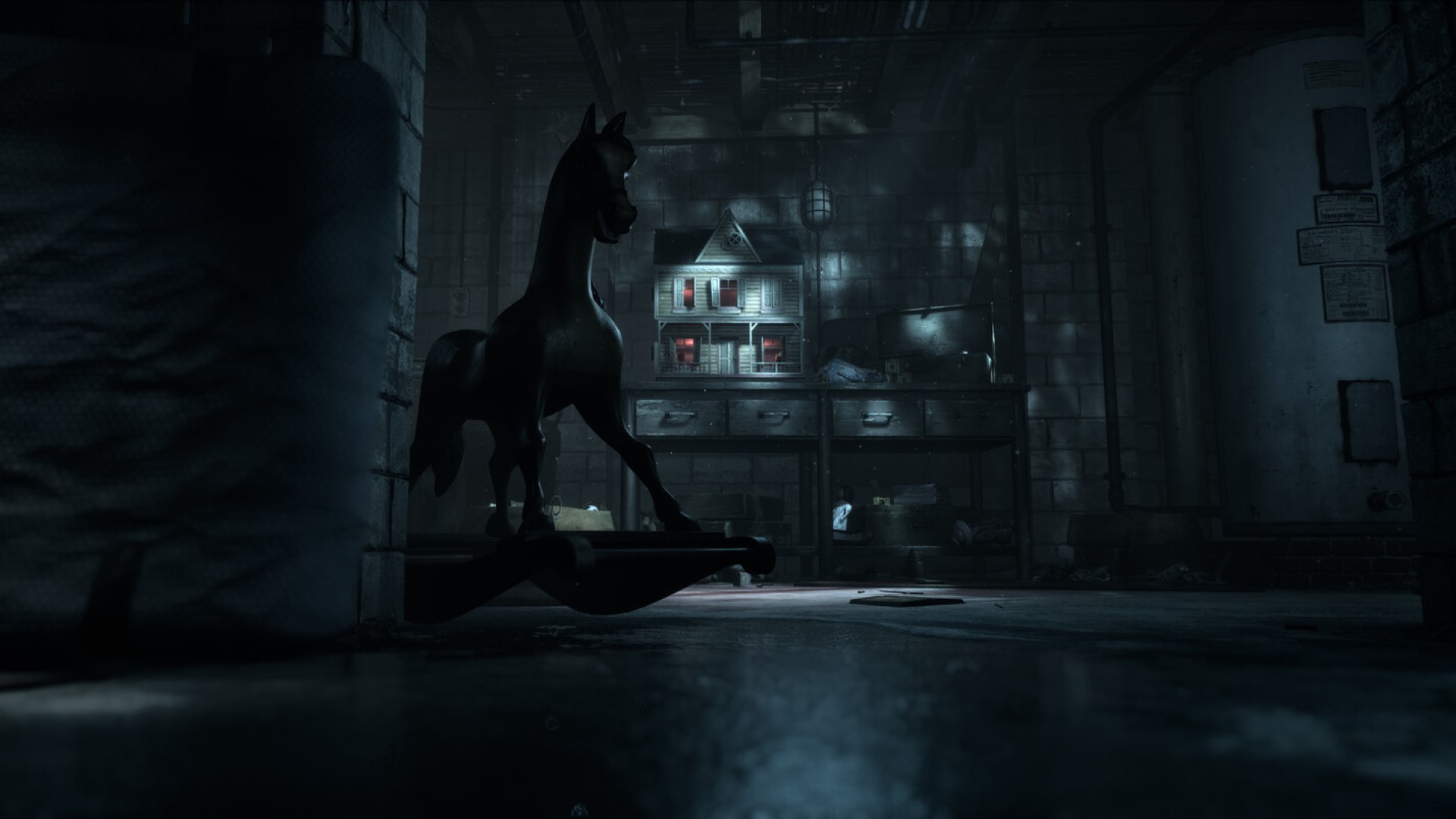
Unreal Engine 5 serves as the base for the remake, with almost everything from models, environments, animations and effects seeing updates. The improvements to materials (especially on clothing), rendering and textures for characters and environments, on top of a higher level of detail, bring the world to life with startling fidelity. It even allows for revamping the system used to inflict injuries on characters, resulting in more realistic cuts and bruises, making some deaths look much more eerie than the original, even without the excessive gore. Meanwhile, ray tracing is implemented for shadows, ambient occlusion and reflections to stellar effect.
Lighting and Shadow Improvements
One of the more notable examples of the new lighting can be seen in the Prologue after Beth storms out of the cabin. The original game featured the rest of the cast outside arguing while they were illuminated by the interior lighting. In the remake, that illumination is more natural and warm, resulting in more subtle shadows and varying color tones. It even serves to light up other background characters, like Emily and Jessica (especially when the latter appeared more shrouded in shadows in the original).
The difference in quality of lighting and shadows is all the more apparent when we follow Hannah in the Prologue as she searches for Beth. The moon rays and the shadows they create in the original are more defined. However, in the remake, they’re softer and feel more natural, resulting in a different kind of atmosphere that’s more foreboding and gothic.
When Beth uses the flashlight on her phone, there’s a defining contrast between its hard glare and the moonlight on the environment. This sequence is a bit extended, resulting in a change of pacing with some extra scares and surprises, but soon follows the same frantic chase sequence and quick time events of the original.
Tone Shift and Model Improvements
Of course, the first Chapter – where Sam arrives at the Blackwood Mountain one year later – is where some more divisive stylistic choices emerge. The original Until Dawn opted for a nighttime atmosphere where, once again, the moon is the major light source. We even see the title’s chapter, “Memento Mori”, with the added text, “10 hours until dawn,” implying that it’s in the evening/early night.
However, the remake removes this text and opts for more dusk-style lighting with wildly different color tones. The jury is out on this and how it impacts the overall atmosphere – some are indifferent, others hate it with a burning passion. Perhaps it’s meant to highlight the increased fidelity, including the higher level of detail in the environment, like more extensive tree branches and foliage. Even the Blackwood Pines sign looks more weathered and defined with discolored textures compared to the original’s flat board, which looks like it was carved out the day prior.
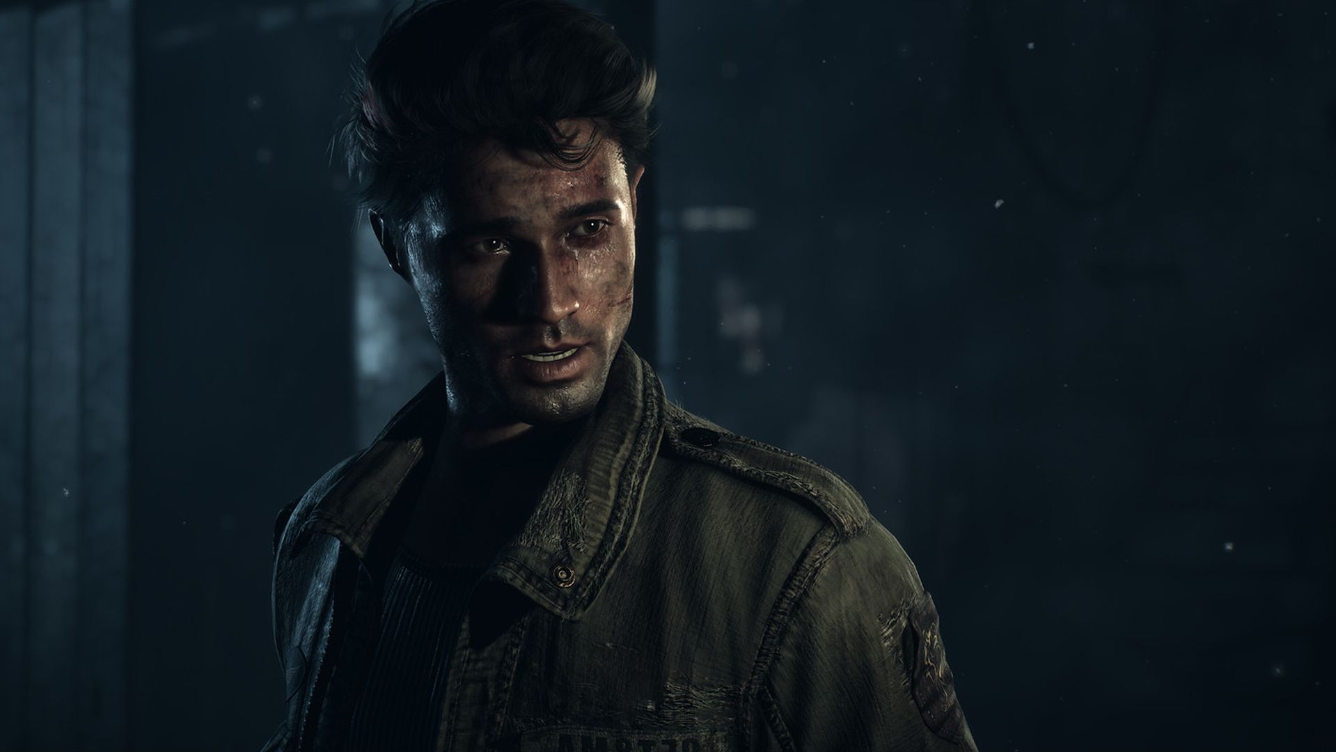
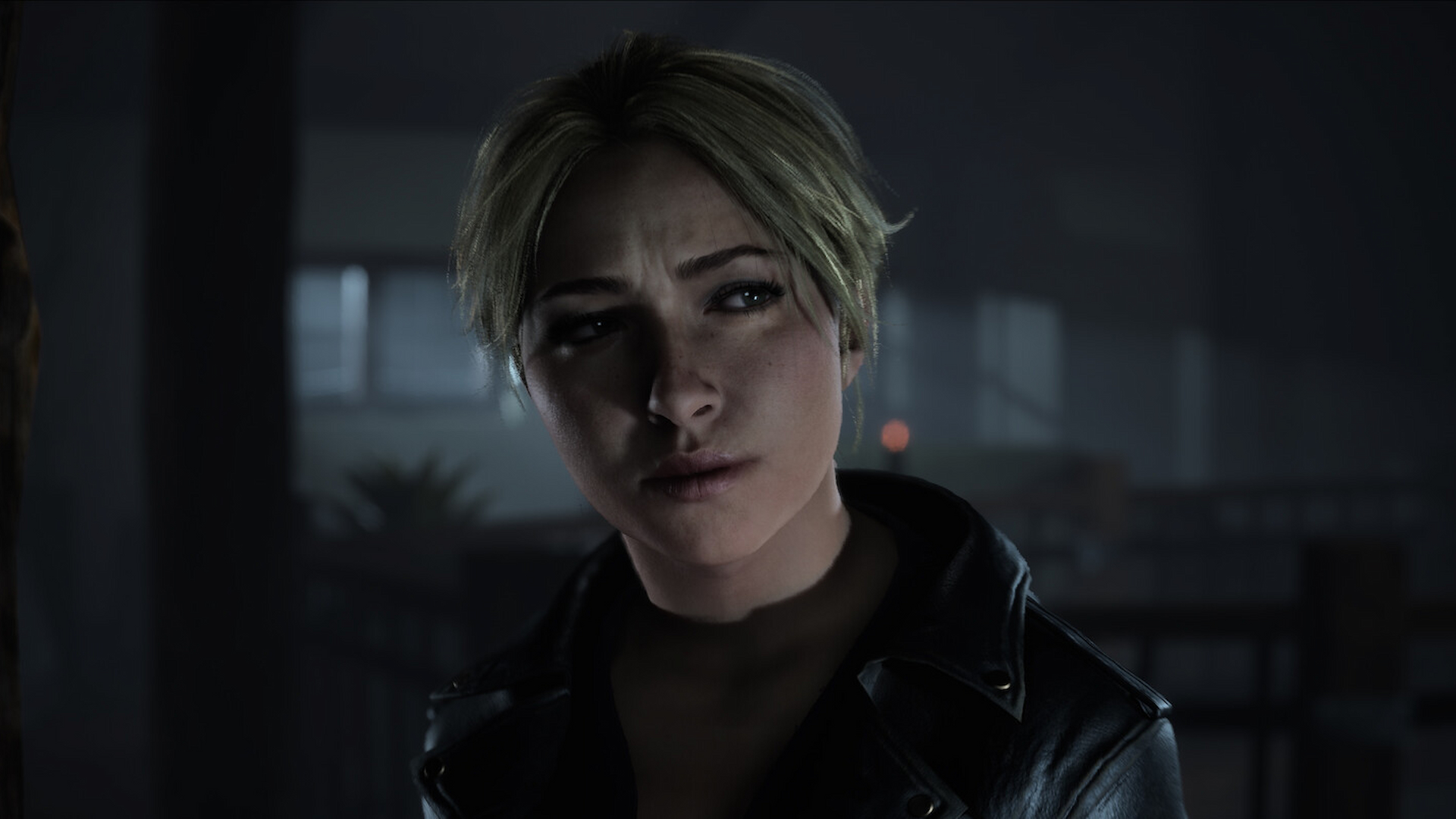
As much criticism as one can heap on some time-of-day changes and their accompanying lighting or the new camera perspective, there’s no denying just how incredible the character models look. The detailed skin textures showcase visible pores while the eyes appear more vibrant. The difference in Sam’s clothing, with the cap featuring meticulously detailed fur strands, or the scarf, with more defined frayed threads, is also simply incredible to behold. Snowflakes on cloth are also more visible, adding further to the attention to detail. The facial animations are also a major upgrade without being too over-the-top.
Overhauled Cinematography
Another interesting contrast between the two versions is how Ballistic Moon revamped much of the cinematography. It varies extensively – take the Prologue scene where Beth leaves the cabin and shows more of the characters outside than the original, a decidedly more subtle change. However, in the cabin in Chapter 1, Sam confronting Josh about no hot water features a different camera angle entirely – which actually shows off more of the environment and lighting but still gives the impression of viewing the action from behind Chris and Ashley. The shaky cam as seen in the sequence where a masked figure chases Josh and Sam, also feels more natural, meshing better when cutting to the figure stumbling.
Overall, the Until Dawn remake is a significant upgrade in visuals. It improves on the base game in numerous ways, providing more haunting environments and extensive detail on its characters. The new cinematography also looks crisp without taking away from the original’s vision and the lighting and shadows look immaculate. First chapter tones aside, it captures the creepiness and harrowing atmosphere of the original to a tee, even amplifying it to new heights. If you’ve never experienced the original, the remake is worth checking, though you might want to wait for patches to address some of the reported bugs.
However, it’s impressive how much the original Until Dawn has held up by today’s standards. As much as I enjoyed the more natural lighting and softer shadows or the rebuilt character models and how much more expressive they are, there’s an atmosphere to the original which feels distinct and oppressive. Perhaps it’s the colder tones and starker lighting which lead to a more dramatic effect, or the presentation. Regardless, PS5 players may want to check it despite the lack of a dedicated upgrade, not only because of a lower price point but to experience Supermassive’s vision first-hand.


Comments are closed.